-
1300 994 890Property Management1300 832 373Consulting & Certification
Understanding Luminance Contrast and Colour Contrast for SDA
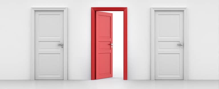
Over the Christmas break, I was catching up on some podcasts, and one caught my attention because it contained incorrect information that confused Colour Contrast and Luminance Contrast whilst misquoting the prescriptive requirements, including 60% contrast being required and using paint swatches against door frames to work out the level of compliance.
In this blog, I will review the prescriptive requirements for Luminance Contrast and Colour Contrast as detailed in the SDA Design Standards so people can refer to factual information rather than incorrect speculation. This is why you need to ensure your SDA Assessor and accredited provider understand these requirements, especially for risk mitigation.
What the SDA Design Standards Require
19.1 All doorways shall have a minimum luminance contrast of 30% provided between:
- Door leaf and door jamb; OR
- Door leaf and adjacent
wall; OR - Architrave and wall; OR
- Door leaf and architrave;
OR - Door jamb and adjacent wall.
Calculating Luminance Contrast
The minimum width of the area of luminance contrast shall be 50 mm.
The formula used for the assessment of luminance contrast shall be the Bowman-Sapolinski equation of;
125(Y2-Y1)/(Y1+Y2+25) where Y2 is the LRV of the lighter area and Y1 is the LRV of the darker area.
19.2 Solid (and non-translucent) contrasting glazing strip of 75mm width and between 900mm to 1000mm above FFL shall be provided for the full width of a glazed area which could be mistaken for an opening
19.3 Toilet seat shall have a minimum luminance contrast of 30% with the background (example, pan, wall or floor against which it is viewed).
19.4 Colour contrast shall be provided between floor surfaces and wall surfaces
What Is Luminance Contrast
Luminance contrast, as outlined in Australian Standard AS 1428.1-2009, refers to the comparison of light reflected from one surface or component to the light reflected from another surface or component. This concept is crucial in various fields, including design and accessibility, as it helps ensure that different elements are distinguishable from one another.
It’s important to note that luminance contrast is not about the difference in colour or colour contrast. Instead, it focuses on the difference in the light-reflective properties of each colour. This means that two colours can have a high luminance contrast even if they are similar in hue as long as their reflective properties differ significantly. Conversely, two colours with different hues might have low luminance contrast if their reflective properties are similar.
Understanding luminance contrast is essential for creating environments that are accessible to everyone, including people with vision impairment. By ensuring sufficient contrast between surfaces and components, designers can make spaces easier to navigate and use. This principle is applied in various contexts, such as:
- All doorways shall have a minimum luminance contrast of 30% provided between—
- door leaf and door jamb;
- door leaf and adjacent wall;
- architrave and wall;
- door leaf and architrave; or
- door jamb and adjacent wall.
- The minimum width of the area of luminance contrast shall be 50 mm.
- Toilet seats
- Tactile ground surface indicators
- Stair nosing’s
- Signage
- Visual indicators on glazing
Measuring Luminance Contrast
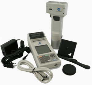
There are two methods to measure luminance contrast: in a laboratory or on-site. Both methods require the use of a costly Tristimulus Colourimeter or Spectrophotometer to measure the ‘Luminance Reflective Value’ (LRV) of each surface. Luckily, most reputable paint, tactile, and nosing manufacturers provide this information to designers, and it is often available on colour charts as an ‘LRV’ value.
Testing Equipment
Equal Access has spent over forty thousand dollars to purchase the appropriate testing equipment for Luminance Contrast Testing to ensure all testing results are fully compliant and can be relied upon by our clients.
For most testing, we use a tristimulus colourimeter with diffuse illumination/normal viewing (d/o) geometry alongside the CIE Standard Illuminant D65. The instrument is capable of measuring absolute CIE values to calculate Yxy. The tristimulus value Y defines the measured luminous reflectance, while the chromaticity coordinates x and y indicate the colour.
The luminance contrast (C) of two surfaces has to be calculated using the following equation:
- C = 125 (Y2 − Y1)/(Y1 + Y2 + 25) Bowman-Sapolinski equation*
- where
- C = luminance contrast
- Y1 and Y2 = luminous reflectance values of the two surfaces
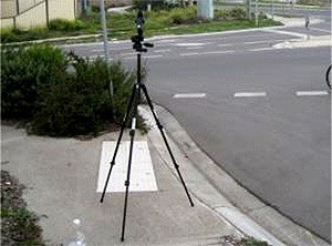
We also use a Single Lens Reflex Luminance Meter, commonly known as a Photometer with a 1° measurement field and a spectral responsivity approximating the CIE 1931 Standard Observer V (λ) function as specified in ISO 11664-1 for testing contrasting bands on glazing.
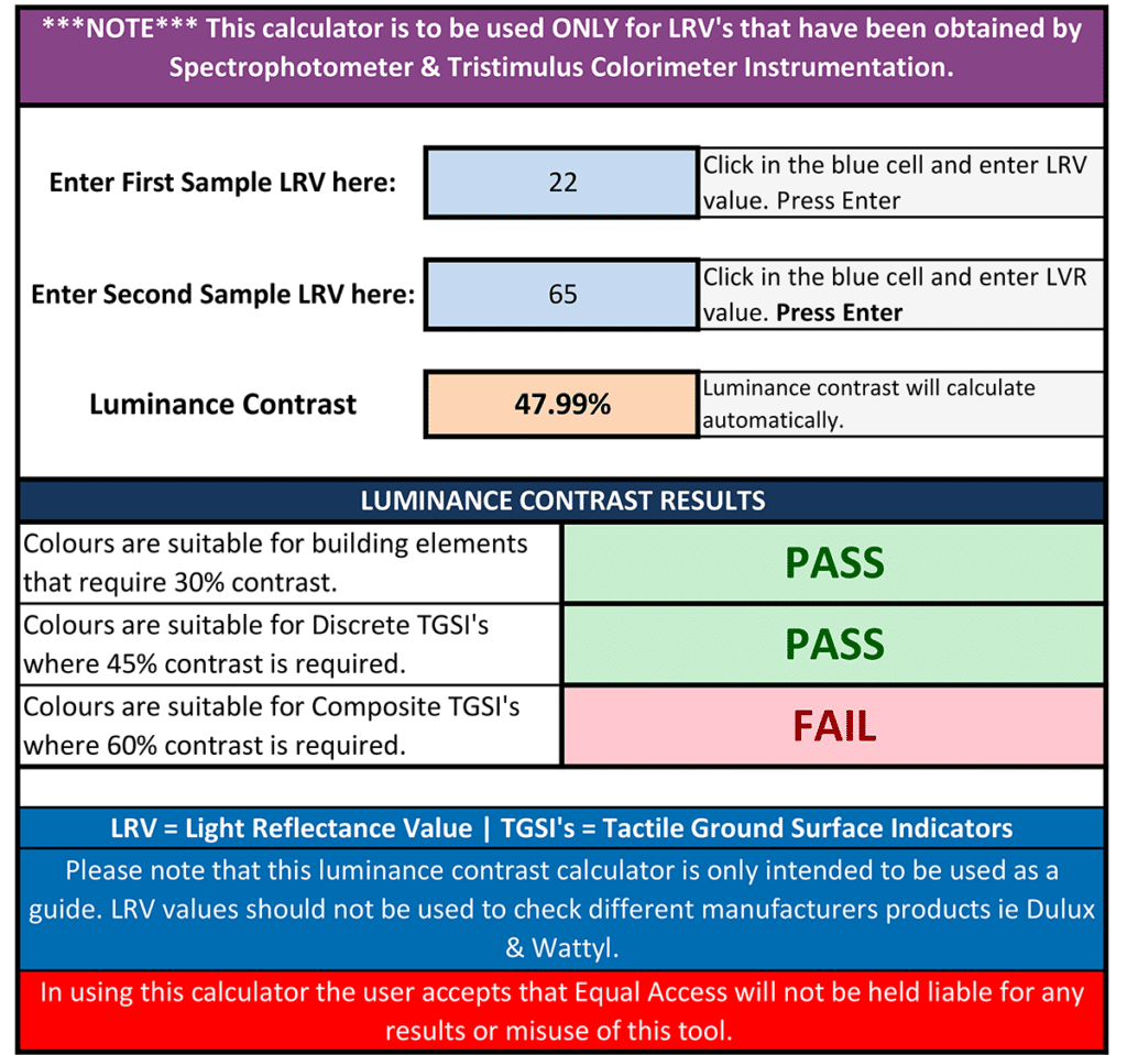
Luminance Contrast Calculators
Most product manufacturers now provide LRV values for their products, including paint, TGSIs, nosings, floor coverings, etc., so confirming the product’s luminance contrast is straightforward.
To assist, we have developed two online Luminance Contrast Calculators to assist designers and certifiers in checking if two colours will achieve a minimum luminance contrast, which takes the hard work out of calculating the value yourself (and without having to decipher the calculations such as the Bowman-Sapolinski equation C = 125 (Y2 − Y1)/(Y1 + Y2 + 25)). It simply requires the user to enter the two values to determine the luminance contrast of the two colours.
Luminance and Colour Contrast Examples
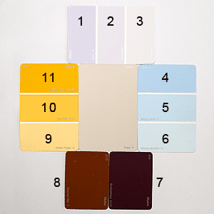
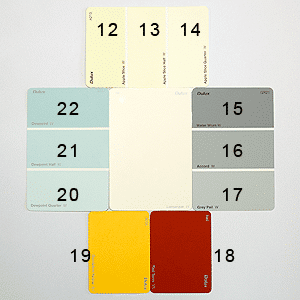
The following are examples of both Luminance Contrast and Colour Contrast. You can see where there are distinct colour differences; the difference in luminance contrast is minimal.
No. Colour Luminance Contrast %
1 Opus 64 0.9
2 Opus Half 71 4.7
3 Opus Quarter 78 9.7
4 Breezy 61 13
5 Breezy Half 69 6.6
6 Breezy Quarter 76 1.4
7 Enchantress 9 77.1
8 Charred Clay 14 68.4
9 Butter Ridge 76 1.4
10 Bee Hall 63 1.7
11 Capitol Yellow 54 9.6
Contrasting with the central base colour, Dulux Lamarque: LRV 89
No. Colour Luminance Contrast %
12 Apple Slice 85 2.6
13 Apple Slice Half 88 0.7
14 Apple Slice Quarter 90 0.7
15 Water Worn 33 47.7
16 Accord 45 34.6
17 Grey Pail 56 24.3
18 Red Terra 16 70.2
19 Dandelion Yellow 67 15.2
20 Dewpoint 77 7.9
21 Dewpoint Half 70 13
22 Dewpoint Quarter 62 19.2
Additional Resources
- Luminance Contrast Calculators https://www.disabilityaccessconsultants.com.au/lc-calculators/
- Luminance Contrast Services https://www.disabilityaccessconsultants.com.au/luminance-contrast-services/
- Specular Inclusive vs Specular Exclusive for Luminance Contrast
https://www.disabilityaccessconsultants.com.au/specular-inclusive-vs-specular-exclusive-for-luminance-contrast-tests/ - Why Most Building Doors Do Not Comply!
https://www.disabilityaccessconsultants.com.au/most-building-entrances-do-not-comply/
Bruce has over 32 years of experience in disability access, architectural design, documentation & project management
He formed Equal Access Pty Ltd in 2006 in response to growing recognition, that whilst businesses were being urged to respond to their obligations under the Disability Discrimination Act, the majority of assistance available was focused almost entirely upon the needs of the individual with a disability without an understanding of the impacts and practicalities for building owners, managers and consultants.
Bruce also specialises in evacuation procedures and policy for people with a disability and is a member of the Standards Australia development committee FP-017 Emergency Management Planning – Facilities (AS3745)
Categories
Recent Posts
- There will be fatalities! It’s not if, but when!
- Creating Accessible and Inclusive Housing: Universal Design in SDA
- Understanding Luminance Contrast and Colour Contrast for SDA
- Disability Fire Safety Forum: Specialist Disability Accommodation
- Converting an Existing House to Specialist Disability Accommodation

